今天在网上查找资料的时候,看到一篇博文里在介绍按键说明的时候,使用了图像来说明键位,而不是常见的符号,使用图像无疑给人的体验更好,于是研究了一下,想着有机会给自己的博文也换上。
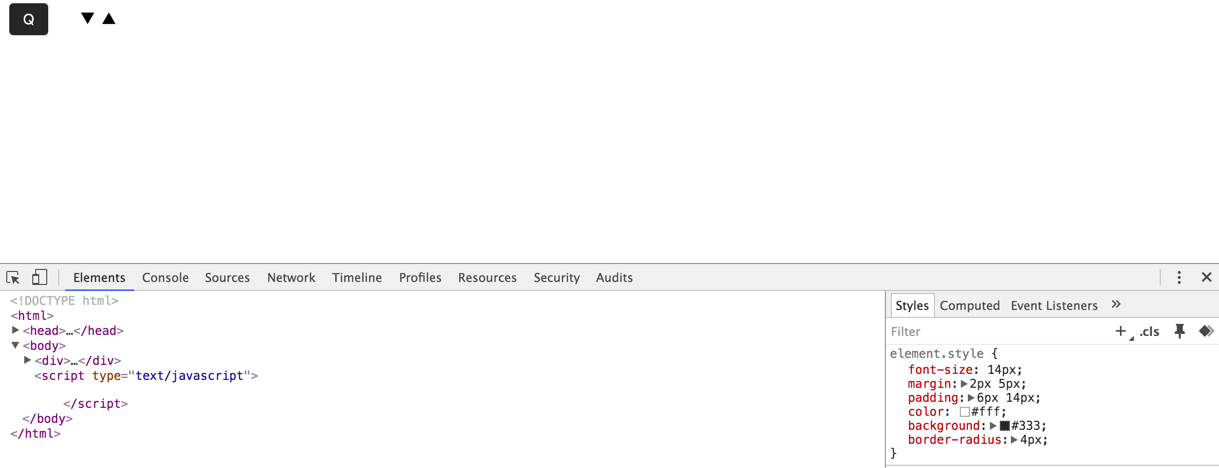
原图效果如下:
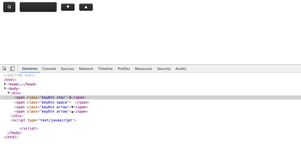
刚开始看到图像的时候也许会以为这是引用图片形成的效果,但看到出现好几个图像的时候直觉告诉我们这应该不是图片了,于是打开审查工具查看,发现是css做的。下面就一步步来看看怎么做的。
首先,每个按键都有一个公有的类,比如定义一个keybtn,然后再是不同按键自己的样式的细调。
	.keybtn{

	}
先来看看我们不加样式时是这样的:
添加每个按键的主要样式背景色,字体大小颜色等:
 .keybtn{
    font-size: 14px;
    /* 定义btn中字母或字符大小 */
    margin: 2px 5px;
    /* 让每个btn与周围有间距不至过密 */
    padding: 6px 14px;
    /* 添加padding撑起内容 */
    color: #fff;
    /* 定义btn中字体或字符颜色 */
    background: #333;
    /* 背景色 */
    border-radius: 4px;
    /* 弧形 */
}
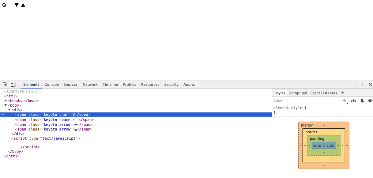
这里先给Q按键加上效果,如下:
大致看上去这样好像可以了,但仔细发现还有地方不一样,问题在于看起来不够真实。因为真实键位可不是看起来这么扁平化的,而且日常使用会让我们的键盘有些发亮,一般ABS材质的键帽容易出现这种情况,也就是俗称的键帽容易“打油”,通过line-gradient给键帽设置渐变来达到一点这样的效果,可是仅仅这样这个键帽还是不够形象,还缺少一个立体感。
要让键帽“立”起来,当然颜色就得有层次了,这种层次怎么体现呢,其实就是给键帽四周添加不同颜色的border,左右两边是一种颜色,上下颜色各自不同,当然这些颜色都与背景色不同啦。border-top的颜色要浅一点。
代码如下:
    border-top: 1px solid #4c4c4c;
    border-right: 1px solid #313131;
    border-bottom: 1px solid #1f1f1f;
    border-left: 1px solid #313131;
好啦~
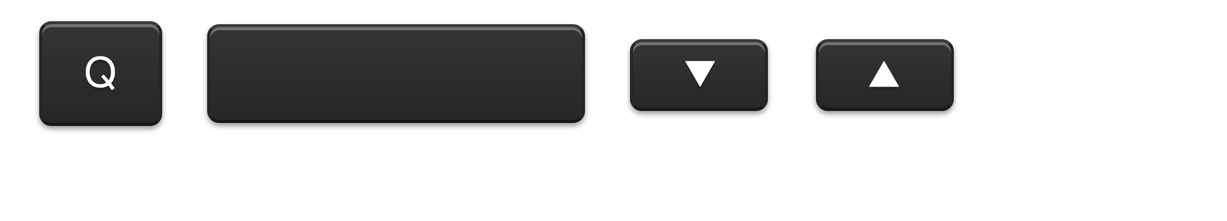
放大给大家看看效果:

这样是要好一点了呢,可是还不够完美,因为光影效果差了点不够立体和真实。说到影当然想到我们神奇的box-shadow啦~给底部的外面加点阴影,给上部的内面加上颜色不同的阴影,代码如下:
box-shadow: 0 1px 1px #afafaf, inset 0 1px 0 #868686;
效果上图:
放到正常大小看就perfect~\/(≧▽≦)/~啦啦啦,如下:
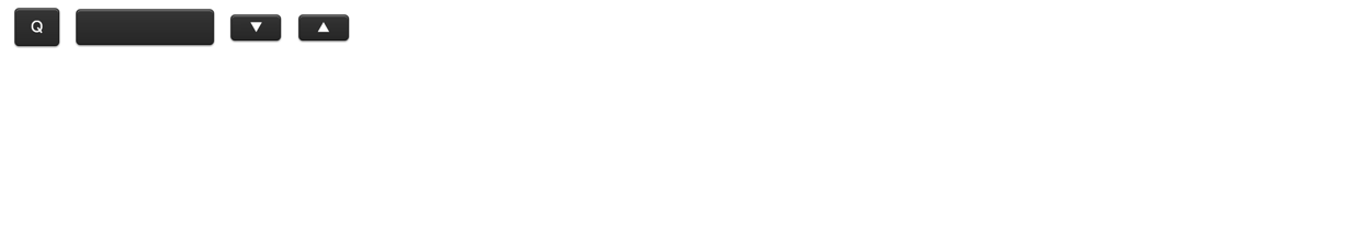
至于不同的键位差别就是通过另设各自的padding来控制大小咯~
这是html:
<div>
    <span class="keybtn char">Q</span>

    <span class="keybtn space"> </span>

    <span class="keybtn arrow">▼</span>
    <span class="keybtn arrow">▲</span>
</div>
这是css:
    .keybtn{
        font-size: 14px;
        line-height: 1.5;
        position: relative;
        top: -3px;
        display: inline-block;
        margin: 2px 5px;
        padding: 1px 4px;
        cursor: default;
        vertical-align: middle;
        color: #fff;
        border-top: 1px solid #4c4c4c;
        border-right: 1px solid #313131;
        border-bottom: 1px solid #1f1f1f;
        border-left: 1px solid #313131;
        border-radius: 4px;
        background: #333;
        background-image: -webkit-linear-gradient(#444, #333);
        background-image:    -moz-linear-gradient(#444, #333);
        background-image:     -ms-linear-gradient(#444, #333);
        background-image:      -o-linear-gradient(#444, #333);
        background-image:         linear-gradient(#444, #333);
        box-shadow: 0 1px 1px #afafaf, inset 0 1px 0 #868686;
        text-shadow: 0 1px 0 #2e2e2e;
    }
    .keybtn.tab{
        padding: 10px 40px 0 5px;
    }
    .keybtn.char{
        padding: 6px 14px;
    }
    .keybtn.space{
        padding: 5px 55px;
    }
    .keybtn.esc{
        padding: 0 13px 2px 13px;
    }
    .keybtn.shift{
        padding: 15px 66px 0 8px;
    }
    .keybtn.arrow{
        font-size: 12px;
        padding: 2px 16px;
    }
    .keybtn.control{
        font-size: 12px;
        padding: 16px 5px 0 2px;
    }
    .keybtn.enter-return{
        height: 42px;
        padding: 0 7px 0 60px;
        text-align: right;
    }
    .keybtn.enter-return .enter{
        font-size: 12px;
        position: relative;
        top: -1px;
    }
    .keybtn.enter-return .return{
        font-size: 14px;
        position: relative;
        top: -5px;
    }
可以查看codepen地址:
See the Pen css-mac-keybord by puronglong (@puronglong) on CodePen.